Betty
A rebranding project of Betty Lash - a lash spa in Austin, TX
Role: Branding
Tools: Photoshop, Illustrator
Goal: Match Betty Lash’s visual identity to its core values and services
Betty Lash
Created in 2006, Betty Lash became the very first lash spa in Austin. The company later combined with a skincare clinic and has since expanded into a well-known boutique that provides various beauty services.
Problem
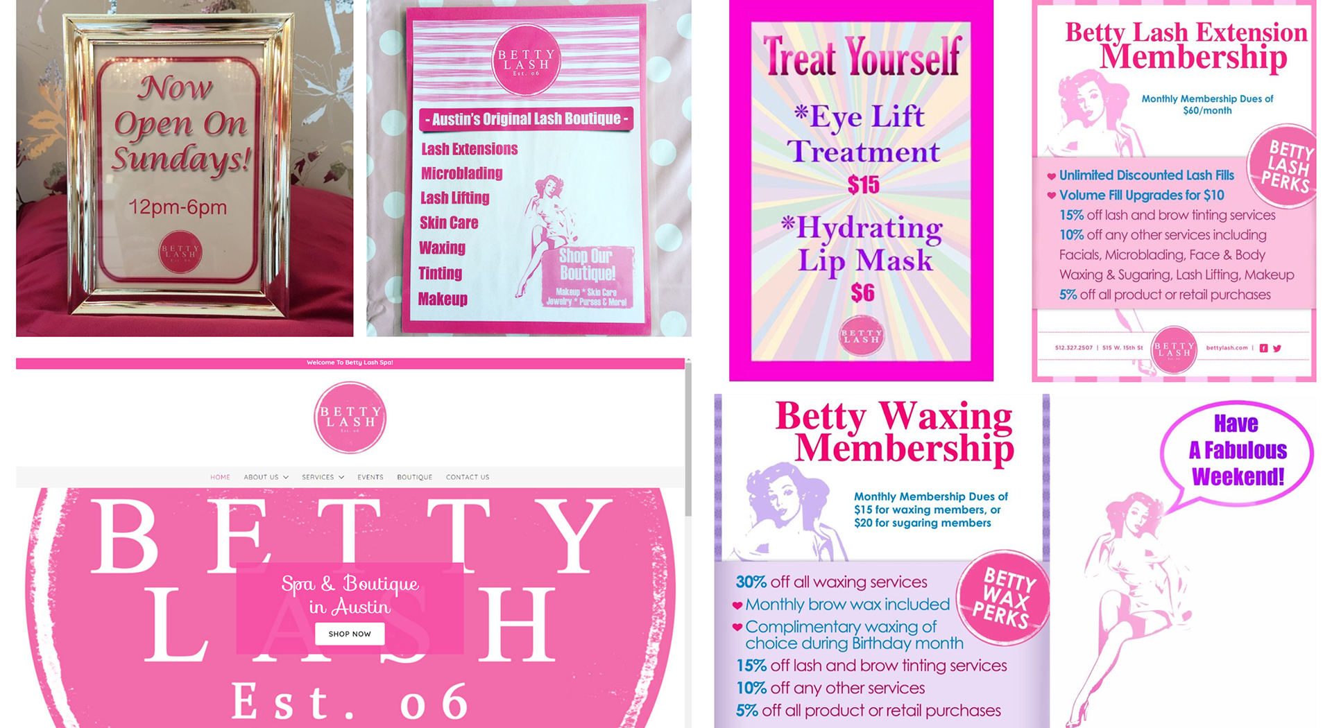
While Betty Lash excels with their values, standards, and services, they lack a clear and unified graphic identity causing a disconnect between its audience and service.
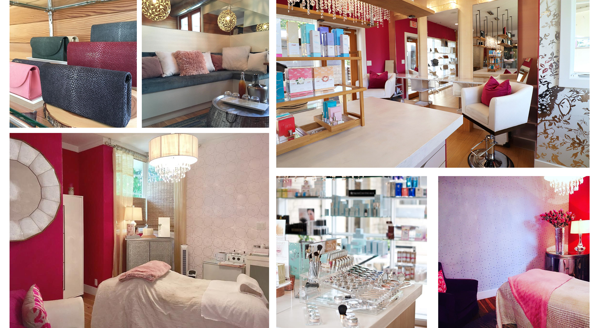
Original Branding
Solution
Combining the lover and ruler archetypes, I wanted to give Betty Lash a clear purpose to base their brand around: they are experts at their craft, and use the highest quality products to boost self-confidence, and appearance, and give an experience of luxury.
Concept One Moodboard
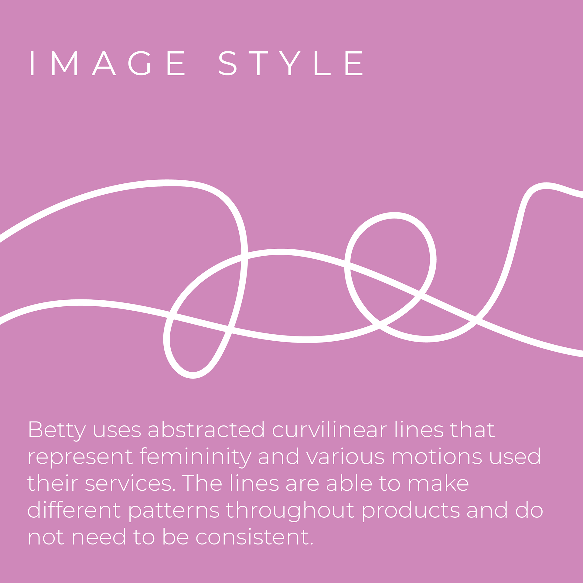
The first concept I explored was more lenient on the lover archetype. I wanted to tap into abstract curvilinear graphics to allude to feminine bodies but also mimic movements Betty Lash specialists use when mixing wax, applying mascara, etc. The color scheme would be muted pink, gold, and white.
Concept Two Moodboard
For the second concept, I was more lenient towards the ruler archetype, taking a more modern and clean take. Contrasting to the first concept, I wanted minimal graphics and a more playful typeface to be the focal point. The color scheme is muted purple, black, and white.
Final Rebrand
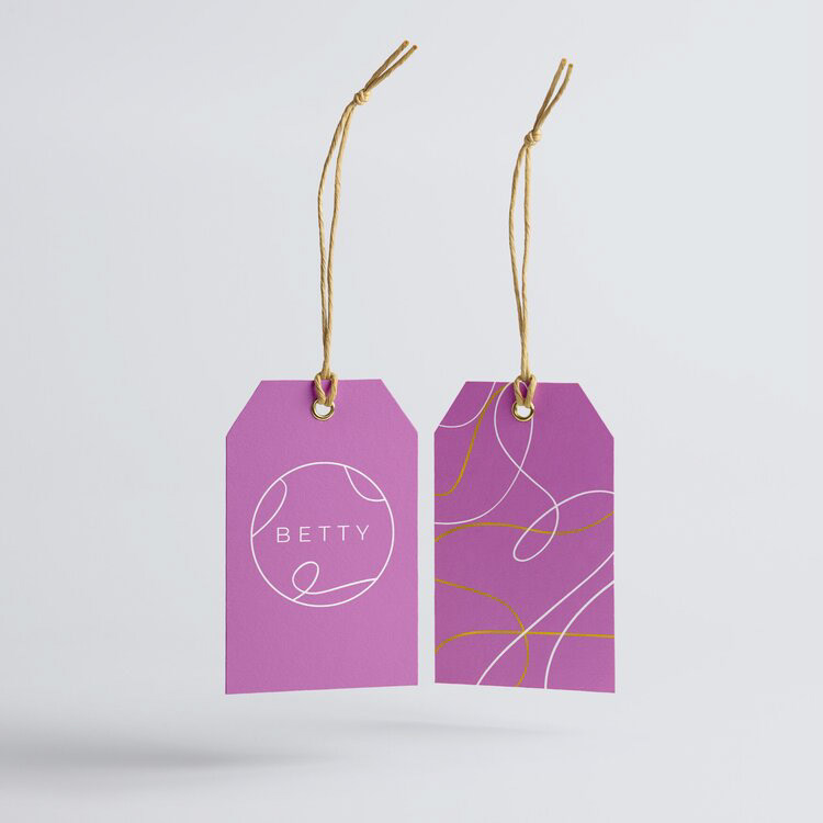
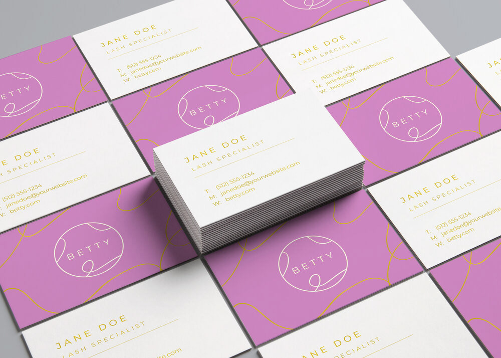
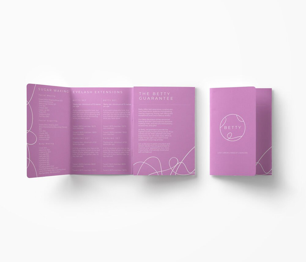
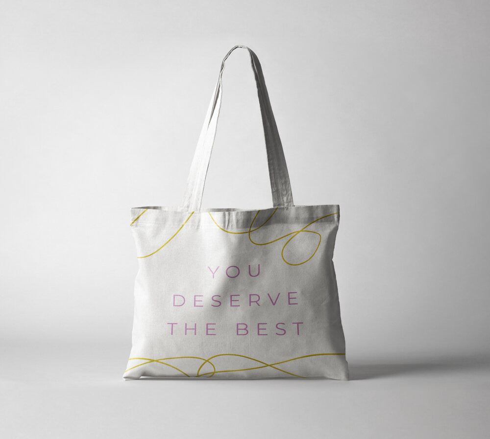
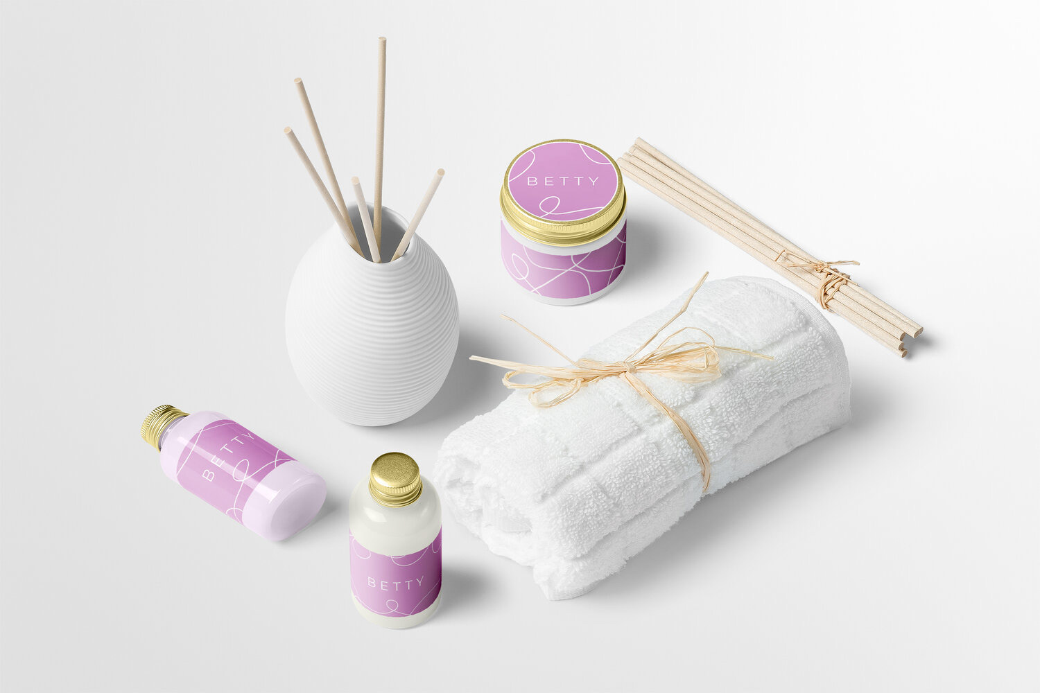
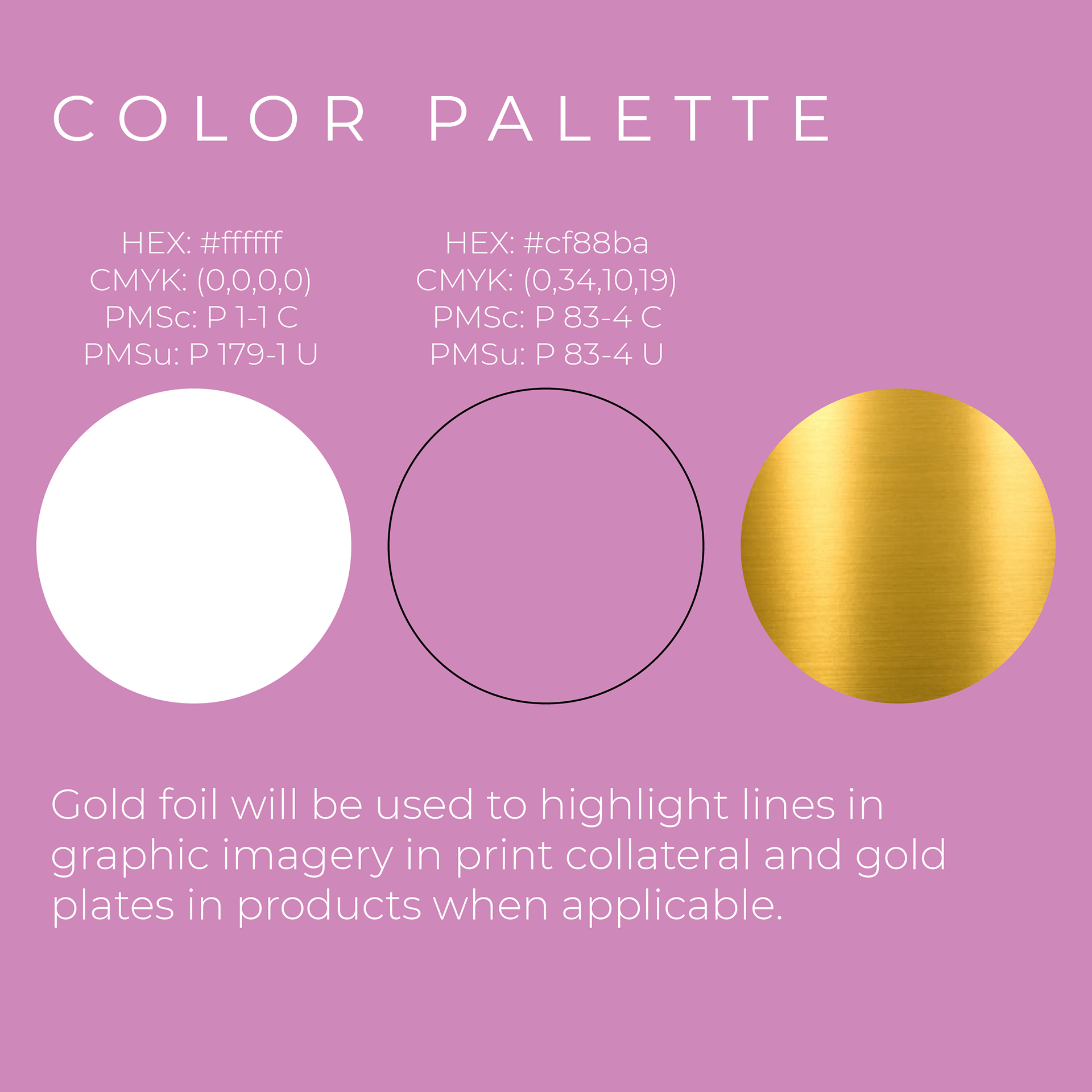
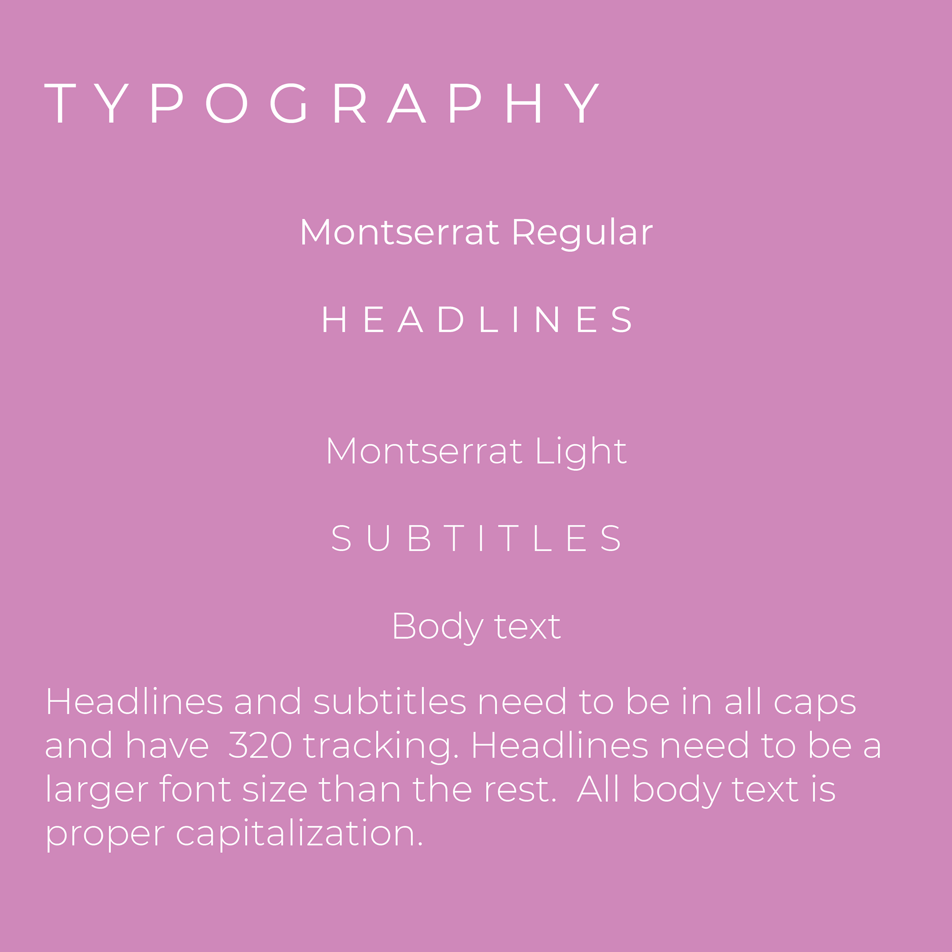
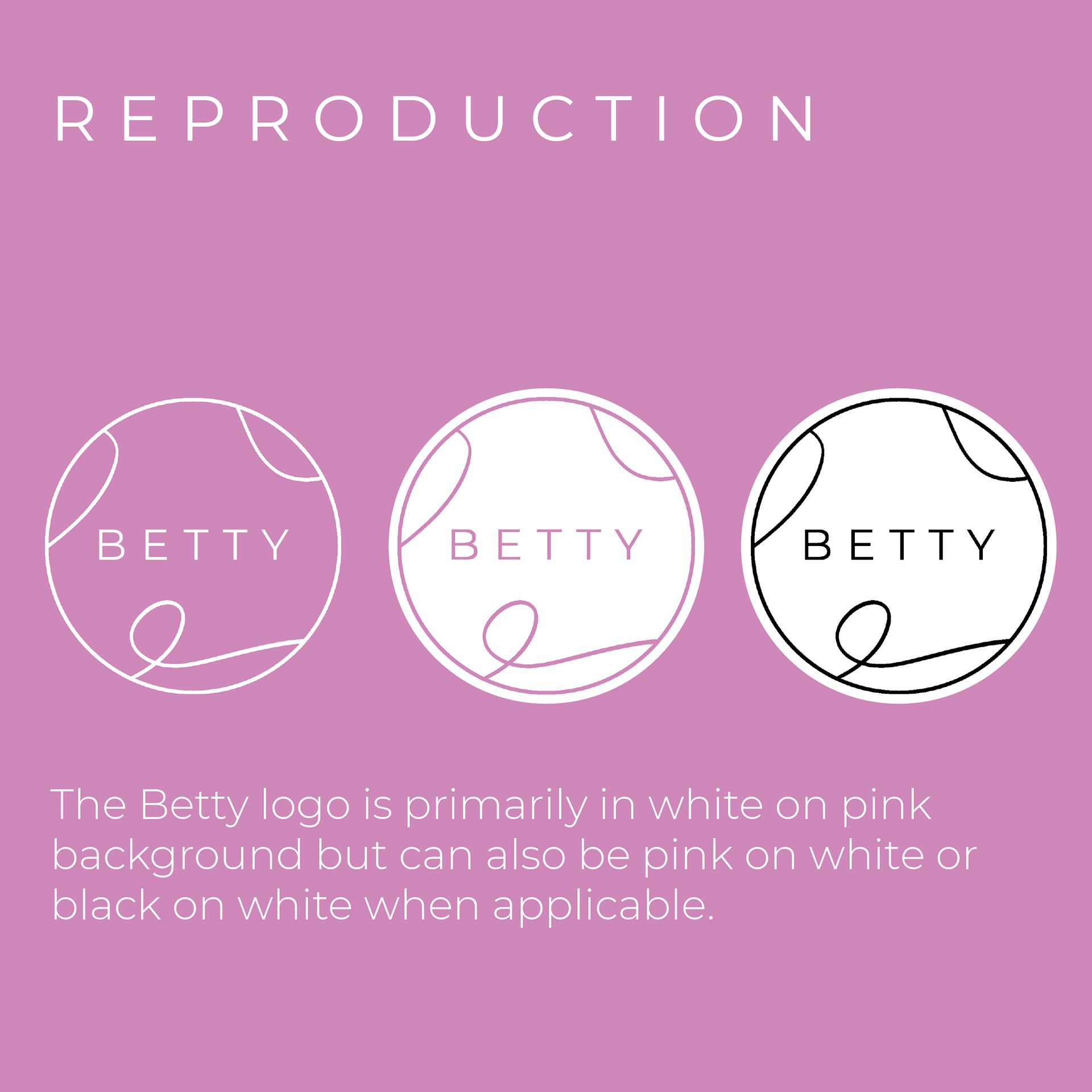
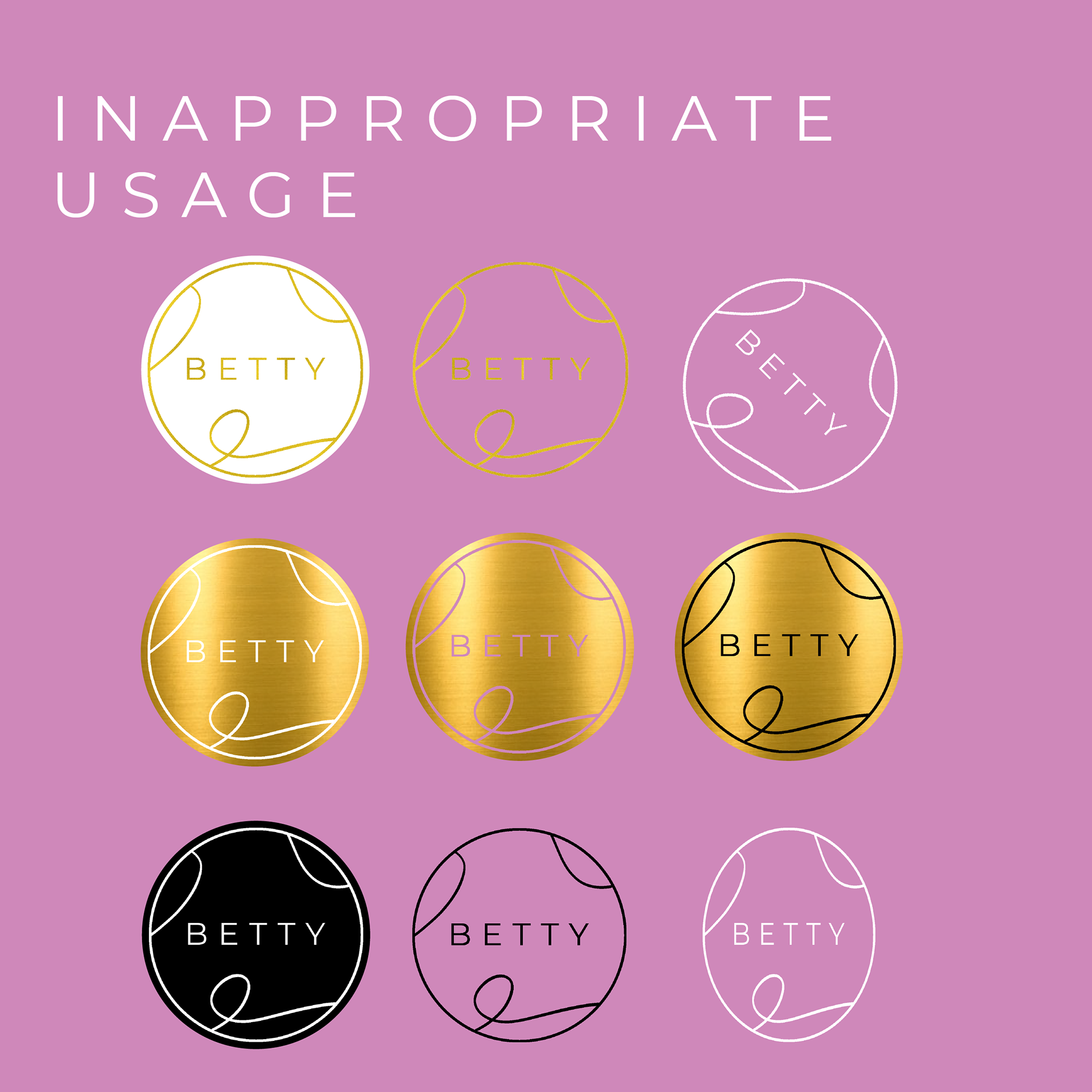
Continuing with the first concept idea, I refined the details to create the final rebrand. Starting with the brand colors, I decided to stay true to the original Betty Lash brand and use pink and white as the primary colors but toned the pink down to be more suitable for all ages. To make the brand feel more elegant and superior, I wanted to use gold as a secondary color for the packaging of beauty products and gold foiling in print collateral such as business cards and price tags. “Betty Lash” was shortened to Betty to showcase their expanding services and to create a persona for the brand and its clientele. Montserrat Regular and Light became the brand’s typeface, and I designed a new logo using abstract forms from the first concept idea.
Logo and Graphics in Use
