Typeface is a Chair
Poster series exploring the relationship between type and physical forms
Role: Poster Design
Tools: Illustrator, Risograph printing
Goal: Create a series of posters using type to mirror the design of a chair
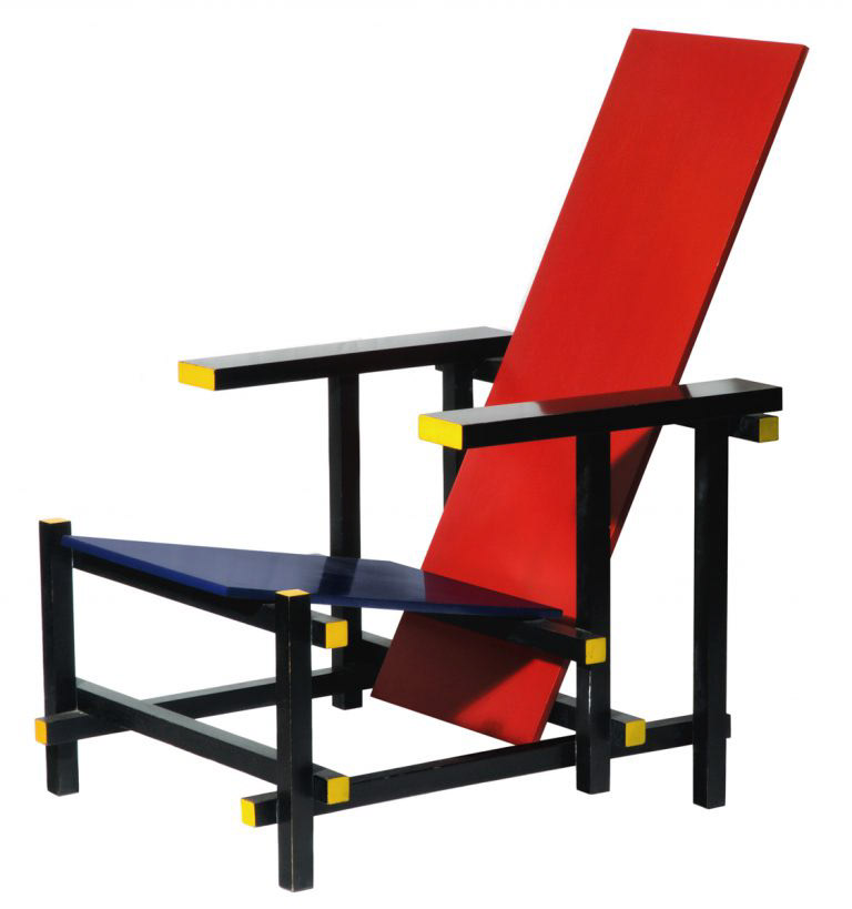
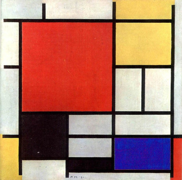
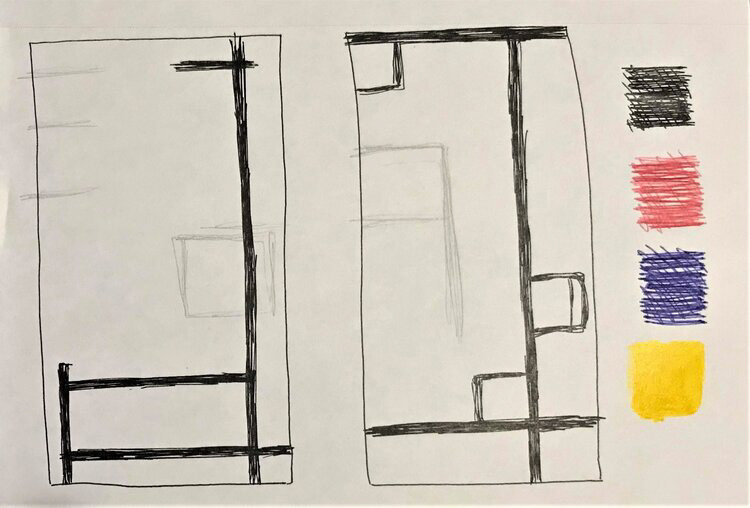
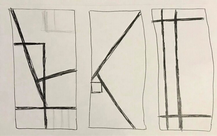
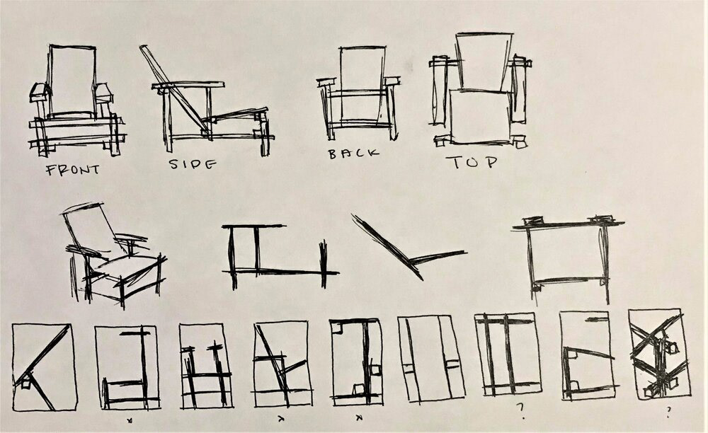
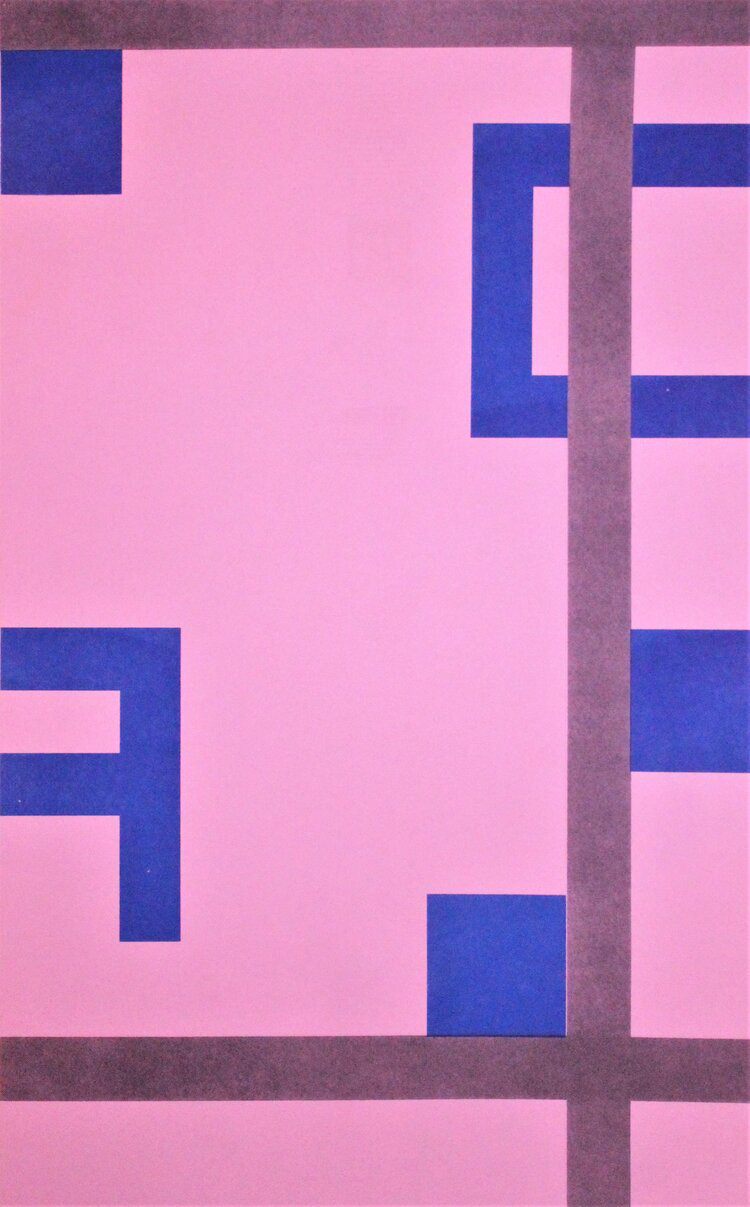
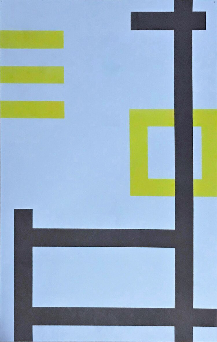
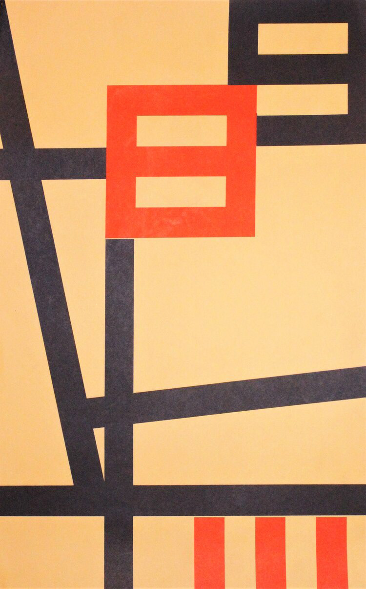
This series of three 11 x 17 risograph posters examines the relationship between a font and a chair. To mimic the sharp and angular geometry in Gerrit Rietveld’s Red and Blue Chair, I paired the typeface P22 DeStijl for its linear forms and a callback to the De Stijl movement. The main focal point I wanted to examine was the structural integrity in both components and how I could intertwine the two to further play with horizontal and vertical planes observed in the Red and Blue Chair.
